
Francis changelog
Dashboards
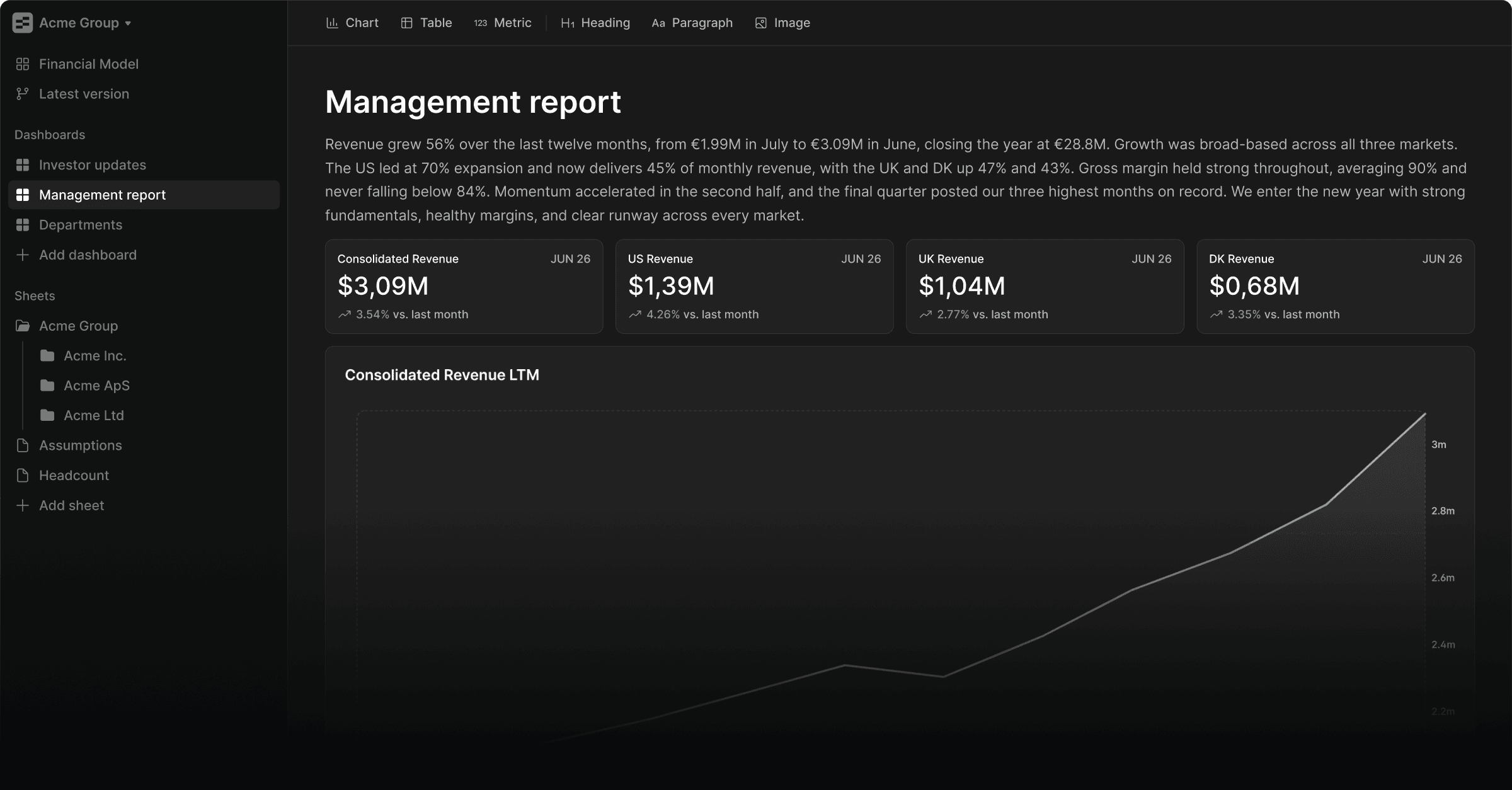
Dashboards
Today we're launching Dashboards, an entirely new reporting environment in Francis and our most requested feature to date.
Reporting in Francis has been rigid, with few options for customization. Your feedback was consistent: the lack of flexibility made it hard to share findings with your teams. Dashboards is our answer — the place you monitor the business is now also the place you report on it, with no deck to rebuild every month.
Charts, tables, and metrics
Dashboards are built from three components: charts, tables, and metrics. Each serves a different purpose. All are built to be flexible.
Use metrics to highlight KPIs, charts to show trends, and tables for departmental breakdowns or budget-variance analysis. Combine and arrange them to fit your story, and fine-tune the details, down to the ordering of table columns.
Headings, commentary, and images
Text commentary has been one of the most requested features on our roadmap. Numbers rarely speak for themselves. Dashboards support rich text formatting and three heading levels, so you can structure sections, explain variance, and guide readers through what they're looking at.
Dashboards also support image uploads, giving you full control of the look and feel of both live dashboards and exported reports.
Live dashboards and monthly reports
Your feedback pointed to two problems: business partnering needs live-updating dashboards, and management and board reporting needs more flexibility. We solved both in one feature.
Dashboards are live-connected to your financial model, so you and your stakeholders always see the latest picture. When it's time to present, they export to a clean PDF, the preferred format for management and investor reporting.
Business partnering
Dashboards work with Francis' limited viewer roles. Share individual dashboards with department heads or regional managers to give them access to their own numbers, without opening up the rest of your financial model. Everyone sees what's relevant to them, and nothing more.
Dashboards are available to every Francis user today. Read more in the docs.